

SMART
CONNECTED CAR MOBILE APP
iOS · Android · Research · IA · Flows · User Testing · Agile Product Management
Connecting Drivers and Vehicles of the Future
The vehicles of the future will be smarter than ever before. Therefore, the services and connected ecosystem offered by automotive manufacturers must be cutting-edge, robust and intuitive. We were tasked with creating a 360° companion mobile app for the incoming fleet of fully electric vehicles. The app would become the gateway for users to seamlessly access and control their electric vehicles. But how do you design an app in a world without a physical key, for a vehicle that does not yet exist?
To comply with my confidentiality agreement I have omitted and appropriated confidential information.

Challenge
In a future where the physical car key does not exist, how might we create an intuitive and delightful mobile app that enables smart drivers to access control and access their fully electric vehicle?

My Role
I was the Experience Design Lead on a fully agile scrum team of fifteen wonderful people from Deloitte Digital Germany + Portugal and the smart PO team. We collaborated over the span of one year from discovery to implementation.
What were my goals?
Be a champion for the user’s voice, needs, and pain points.
The business requirements must be appropriately reflected in the experience.
The app must be seamlessly integrated into the smart digital ecosystem.
The solution must be technically feasible and leading edge with the latest mobile best practices.
What were my responsibilities?
Qualitative and quantitative discovery research (user, landscape, best practice)
Design concept, information architecture, navigation, flow, wireframing and prototyping.
Iterative user testing throughout the entirety of the project.
Product management and requirements gathering.
Scope & Constraints
I was tasked with designing a fully native mobile app available on iOS and Android that was to be rolled out across all of Europe within one year. The app would then be adapted for Geely users/drivers in Asia.
Project pain points and considerations
The vehicle did not exist at the time. The app we were designing was for the next-generation fleet of smart electric vehicles.
smart is fazing out their physical car keys so the app would become the gateway into the user’s vehicle.
The planned feature set of the app and vehicle was significantly greater than that of competitors such as Tesla.
Requirements were unclear and shifting even after implementation.
Many integrations with internal infrastructure points and external partners for public charging, wall box charging, and maps.
The PO team was brand new with zero agile experience.
The Process
My design process is based on the new double diamond model for divergent and convergent thinking by the British Design Council. A key takeaway is that various phases are happening concurrently and iteratively. On one epic or story, I might be doing exploratory research for one epic while performing user testing on another feature.
In general, we used an agile delivery method where our scrum team consisted of designers, developers, QA, scrum masters, and POs. The designers aimed to work two weeks ahead of the development team to check feasibility and ensure consistent delivery.
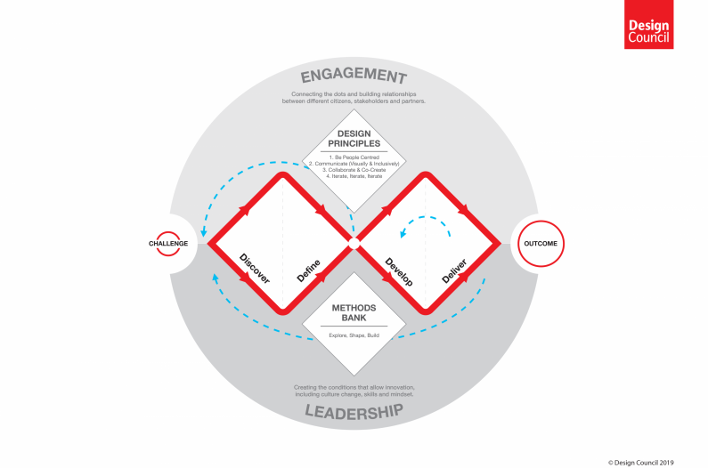
The new Double Diamond model: Framework For Innovation by the British Design Council
Understand and Discover
The primary focus of this step is was to help me understand, rather than simply assume, what the problem is.
This involved speaking to users, exploring best-in-class examples and competitors, and understanding business needs.
The PO team workshopped to prioritise the initial requirements on impact and complexity.
Define and Explore
After synthesizing the insights from discovery, key user pain points and needs are elevated in the form of a design approach and prioritized business requirements.
Quick user flows, draft information architectures, and rough concept prototypes were created to test assumptions and receive feedback from users, stakeholders and development teams.
Develop & Test
The best concepts and flows were turned into detailed clickable wireframes and wireflows.
These initial concepts were tested lightly
Deliver & Listen
The best solutions were chosen and selected to refine and develop further into UI and eventually into implementation.. These solutions were tested further by users for insights and iteration.
Understand & Discover
This is arguably the most important step: a problem well stated is a problem half solved? How can understand the problem and users?
User interviews
Video interviews with users in Europe were conducted to better understand their context, needs, and pain points. I created the script and sourced five EV owners across Europe - it was important that they have direct experience with driving and maintaining an EV.
What are their needs?
EV drivers need control over the WHEN, WHERE, and HOW of their charging experience.
This is especially due to the fact that charging infrastructure is not great outside of urban areas.
Most users wanted to lower their carbon footprint
Cost savings is deemed an important factor in selecting an EV.
Users want to be proactively informed of vehicle status and educated on how. tobe the best driver and owner.
What are their pain points?
Feel a lack of autonomy due to battery/charge range.
Existing smart car apps were split into two, one of EV and one for general control
Unreliability, unresponsiveness, and lack of functionality in their previous connected car apps.
Not much visibility and control over the charging experience.
Missing info on public charging point availability.
We also gained fantastic insights into general smart car sentiment, home charging behaviour and some feedback on other services that were passed on to other teams.

Survey
A survey was conducted to glean key demographic data, device and app usage information, and determine the priority of various needs of EV drivers. I sourced participants from the robust online EV community, mainly via Facebook groups and other forums.
Participants were asked to score features we planned to have into the app mainly on desireability. I used a formula in excel to determine the priority of the app requirements from a user perspective.


Example of one feature set that was ranked and used as an initial prioritisation for roadmap creation.
Landscape Review
To supplement the user research and gain a better understanding of how smart fits within the wider domain, I conducted a review of 14 connected car apps. I was mainly looking at functionality and features, navigation patterns, and app ratings. I was limited by the fact that I did not own 14 different cars to test the apps, but I could see a lot using screenshots in App Annie. Findings were documented into Excel and eventually Confluence.
Define & Explore
Equipped with insights, the next step was to define the user and their experience in the form of personas and a user journey. I also explored the general structure of the app, the information architecture, and how users might navigate throughout the experience.
On the product management side, the PO team held a workshop to prioritise the initial requirements on business and user impact and complexity using an Excel tool that I created.
Personas & Journey
User insights were framed into personas. A subsequent remote journey mapping workshop with key stakeholders was conducted to align on a singular vision.

Meet Lucas, one of our primary personas

The outcome of a user journey workshop with POs and stakeholders
Develop, Test, & Listen
Concepts are ideated and iterated upon with frequent feedback rounds. Then, they were pulled through various levels of fidelity until the development teams created working software. The UI Designs and working app were tested for feedback.
Flows & IA
It was crucial that the initial structure of the app reflected the needs of the users to facilitate intuitive wayfinding. We elevated the core functionality, such as vehicle control, climate, and charging into the primary navigation.

Sketches & Concepts
With small feedback loops with the PO and development teams, I iterated upon initial paper and digital sketches to create the concepts for the core functionality in the app.

From left to right: Home, Charging, & Climate screen concepts.
Wireframes & Prototypes
The concepts were used as a reference to create iterate further upon specific sections and features. Detailed wireframes and click dummies were drafted and solidified through further user input and feedback loops with the PO and development team, which led to the final approved UX. These were then taken through the UI design and development processes.

Home screen clickable prototype

Home screen - from concept to wireframe: you can see we simplified the default interface too allow key elements and statuses to shine.

Controls screen - from concept to wireframe: We initially packed the controls screen with many features but upon deeper research and testing, we discussed some of these fit better in other sections.

Flows were pieced together as an artefact for the POs and developers to understand the variations of logic and states.

User Research
At various points throughout the project, the UX and UI prototypes and implemented app were taken through various rounds of user research. The tests were (mostly) successful in challenging our hypotheses, testing assumptions, and, ultimately, understanding how our app performs in terms of navigation, usability, and comprehension.
I conducted several rounds of quick, in-person interviews and testing sessions usually with a mobile device and low to mid-fidelity designs throughout the duration of the project. This. was mainly to get quickly gather information or feedback on certain approaches.
In addition, I planned and confucted formal rounds of usability testing with high fidelity designs or implementation with the test plan, and script, facilitated and summarised by me.
The most important takeaway is that I learned valuable insights that steered me, the team, and the designs in the right course: the direction of addressing the users needs and pain points.

An excerpt from the wrap up report for one the usability testing rounds conducted with eight participants. We tested core functionality such as the Controls and Climate sections using a prototype.

Meet the Smart Control App
At the time of writing, the app has not been released publicly. But I am quite proud of the outcome from the team. We put our minds together and poured our sweat and tears into this app, which I believe to be one of the best in the market for vehicle access and control. The app feels usable, delightful, yet elegant and intuitive - I hope that our users do as well!