

DAIMLER MERCEDES-BENZ
Vehicle Subscription Greenfield Concept
Web Design · Greenfield Concept · User Research · User Testing · Ideation
The Future of Mobility
Traditional ownership models and behaviours are being disrupted. More and more, people want alternative ways to own property, clothes, and vehicles. We were tasked with envisioning a novel, blue-sky vehicle subscription service for Daimler Mercedes-Benz. The concept eventually lead to Deloitte Digital winning the MVP project.
To comply with my confidentiality agreement I have omitted and appropriated confidential information. These designs are a reinterpretation of the original.

Challenge
How might we design a blue-sky experience of a novel vehicle ownership model subscription service that engages and delights?
My Role
I was the Experience Design Lead at Deloitte Digital Deutschland and worked on a team comprised of an automotive industry strategist, UI designer, a systems architect, and the Head of Experience Design and Mobile. This project was a fantastic learning experience especially due to the fact that I was presenting and collaborating directly with C-level executives at Daimler and Mercedes-Benz. We collaborated over the span of two months to create the concept for Daimler’s new product offering.
What were my goals?
Ensure that the users’ voice, pain points, and needs and reflected within the concept.
Gain an understanding of the competitive and best practice landscape.
Assess the feasibility of the experience concept from a technical perspective.
Create an intuitive experience that excites and engages.
What were my responsibilities?
Qualitative and quantitative discovery research (user, landscape, best practice)
Design concept, information architecture, navigation, flow, and wireframing.
Presentation of research, design and concepts to executives.
Handover and close collaboration with UI designer.

Scope & Constraints
The engagement was fast and furious. The focus was on the subscription acquisition funnel itself from vehicle selection, subscription configuration, checkout, and delivery. We also had to consider what happens after acquisition - the subscription lifecycle management. I had two months to design the subscription journey on desktop and mobile web starting from discovery. How can a user subscribe to and manage their vehicle service?
Project pain points & considerations
The vehicle subscription product/service is brand new and not well understood by consumers. How do clearly and intuitively get the user to comprehend the new service?
The business model was not fully established by Daimler with unclear requirements that needed much refinement.
Due to it being a greenfield concept, the clients were open to pushing the boundaries of the branding.
Daimler wanted a concept that was visually and interactively engaging but we needed to consider an experience still within branding boundaries.
How do we get the user to comprehend what it is they are buying. Clearly and intuitively.
We also needed to envision the end to end experience - what about the subscription lifecycle management?
The Process
Our team was constrained by a tight timeline so we needed to be as efficient as possible to yield the best outcome so a “leaner” approach was utilised. I utilised the double diamond model of divergent and convergent thinking in this engagement.
I worked closely with an automotive industry strategist early on to better understand the strategic business approach, users, and domain space. I worked with him to create a customer journey which formed the basis of a user flow and detailed wireframes. Subsequently, the UI designer and I worked closely to create a thrilling, yet usable and functional UI concept. We had weekly check ins with the client team gather requirements and receive feedback on our work.

Understand & Discover
The discovery, while compressed, yielded important insights that helped steer the outcome in the right direction. I reviewed existing research on users and completed a competitive/landscape review to help guide me and the clients during the definition phase.
Research Exploration
The internal team, hand in hand with Deloitte’s strategy team, created an extensive report that dove into behaviours, needs, pain points, and archetypes of those who were likely to subscribe. This was a fantastic starting point to understand the problem space.

Landscape Review
The competitors we dove into were Cluno, Care by Volvo, and Sixt+ as they applied a business model that would be similar to that of Mercedes. I explored each platform and app to understand the content strategy, flow, navigation, layout, and perceived usability.
Each competitor clearly showed the monthly price with as little complexity as possible while also displaying what is included. But each had varying levels of complexity and methods of customisation that respectively had pros and cons, such as less data gathering up front which meant more work after subscription. We also compared various aspect of the product design journey to help the client make strategic decisions around their own model.

Cluno

Sixt +

Competitive analysis

Formulation of Mercedes-Benz approach
Define & Explore
With insights in hand, I held a workshop to formulate a rough customer journey that we could use as a basis to further the definition of the experience. From there, I crafted initial flows that matched that business model that we had collectively aligned on.
Taking shape
The concept structure began to take shape with varying levels of fidelity from a journey map, simple flows, to more complex wire flows.


A rudimentary flow to express the main steps the user needs to take to finish a subscription.

We expanded the user flow to include more detailed information regarding content and requirements.

Develop & Test
Once the general structure was approved, I crafted a wireflow and eventually detailed wireframes that expressed navigation, content and info hierarchy, and interaction.

We reduced the necessary data entry steps to the bare minimum to simplify the experience.
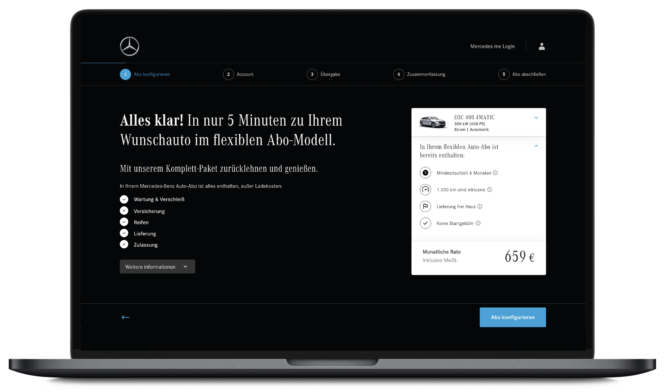
Focussed engagement
A focussed and conversational approach for configuration and data gathering was used to maximise engagement and drive acquisitions. The user can see a complete summary of their subscription on the right side.
Account & Verification
Shortly after the configuration of the service, we asked the user to create a Mercedes Me account which could autofill customer data and would be crucial for the lifecycle management afterwards. Another key design decision made was to move the mandatory identity verification step to after they’ve subscribed to reduce the barrier of entry.
Dashboard
An intuitive dashboard was designed that proactively updates the user on key milestones and actions required by the user. Here, they. can manage the full 360 degree of their subscription.

Responsive Web
Mobile web screens were designed in parallel to ensure the subscription experience was seamless across all touchpoints.
User Testing
User interviews and testing were conducted to gather more insights about user behaviour and ways of thinking/doing and also to test hypotheses and assumptions. I sourced seven participants who were vehicle owners and had heard of vehicle subscriptions. We gained tonnes of valuable insights such as key needs and pain points in the interviews and used the feedback from the user testing to iterate further.

Six scenarios were tested during the research phase
„There was no confusing stuff or I took a step I couldn‘t remember.. I am confident that things are going right.“
„From a UX perspective, everything was great with new and fun component but the story excitement was missing.“
„Things like cancellation policy and changing my subscription need to be stated out more clearly..“

Overall, users were successful in completing their scenarios and rated the average overall experience a 4.5/5.
Recommendations
Overall, the user interviews and research were incredibly successful in guiding us in product design decisions. The feedback was used to iterate further and lead to the final concept.
Approach of design and subscription model foundation is solid
Continue with Subscription Flow approach with minor adjustments to the design and considerations for the model.
Payment option and review optimisation
Highlight the payment option step first and review details is second in the flow.
If possible, add additional payment options such as Paypal.
Make it clear how to navigate by making the bottom bar more prominent
At first, users struggled with finding the „Weiter“ button.
Help the user know where the they are located in the flow
Some participants wanted to know what step is next or where they are within the substeps.
Consider showing the next step in the flow.
Increase delight and excitement throughout the journey
Showcase engaging photos of the vehicle and add moments of joy through the interactions.
Show helpful information for the user contextually during the flow
E.g. On the term page, show the cancellation policy.
E.g. On the mileage section, show them what an average city driver consumes in a month.
A Moving Subscription Experience
The proof of concept was ultimately approved by the clients and we were all happy with the outcome! It laid the groundwork for the actual MVP and was a key ingredient in the subsequent RFP that Daimler put forward, and that Deloitte Digital eventually won.
