

Ippon Technologies
KIMONO DESIGN SYSTEM
Design System · Style Guide
The Kimono Design System is an internal initiative that would serve as a source of truth for design and development teams at Ippon Technologies. The system promotes collaboration and encompasses both abstract elements and functional tools to enable teams to design, realise and develop more consistent and efficient solutions for clients. The goal was to implement a design system to craft more holistic designs and builds between designers and our software engineers.
Why a design system?
There were three motivations behind rolling out a new design system at Ippon Technologies:
Prior to the implementation of Kimono, teams would leverage patterns, libraries, and components from differing sources. This is not inherently wrong but the lack of a holistic design standard meant the quality of the solution delivered for client or internal engagements varied.
There was a push to drive efficiency and consistency across the board because our consultant teams were engaged with many brands and industries. The system was required to be focussed enough to improve performance and consistency but also pliable enough to cater to a wide breadth of solutions.
Accessibility should be a priority rather than an afterthought so we wove accessibility throughout the system in areas such as colour and typography.
What did I do?
To bring Kimono to life, my role required close collaboration with the Head of Design and a software engineer. My responsibilities included:
Contributing to key areas of the design system such as typography, UI components, and colour
Creating the Sketch text style guides, icon and data table library
Collaborating in the creation of the document itself (layout & design)
The Benevolent Sherpa
Since the design system was not for the Ippon brand itself but as a tool for its consultants, Kimono needed to act more like a benevolent sherpa as opposed to a strict dictator by nudging its users to push better design decisions. The Kimono system could not be prescriptive because we knew that it may need to lend itself to situations when design systems and style guides did not exist.
To kick off, we spent a week researching the best design systems across various industries to understand what makes a design system great (I personally loved The Canadian Government’s Aurora and IBM’s Carbon systems). Kimono would help new Ippon-ites understand and drive a coherent set of design principles and patterns in design and development.
Colour
The primary focus of the this section was to define the role that colours plays in visual communication and provide best practices when considering brand identity and accessibility through contrast. We also suggested contextual colours for elements such as error or system messaging and provided helpful example colour gradients.


Typography
The typography section first explored the role that type plays in communication and also provide guidelines for getting typography right. This section included:
Optimised and accessible typefaces for various uses such as titles, headings, display, body, etc…
Consideration and best practice around line height/leading, lengths, and weights.
A type scale that works harmoniously with both small and large screen sizes to promote accessibility, rhythm and harmony within a design.
Sketch text style libraries for small and large screen sizes.
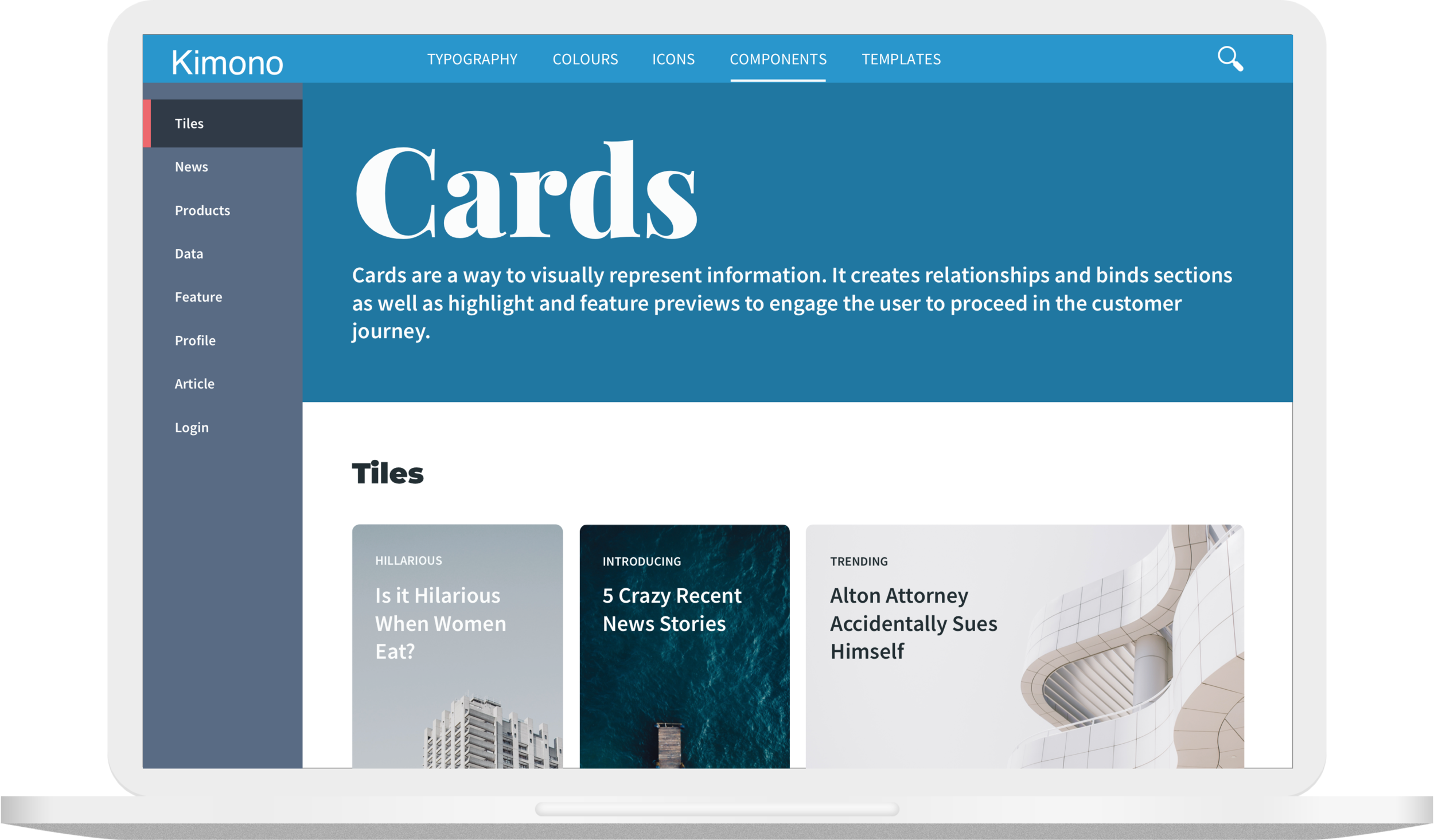
UI Components
The final component of the system was a UI component library modelled around the latest best practices. This library included standard atoms such as icons and buttons and included complex molecules such as cards and data tables as these were frequently required on engagements.
For the icon library, we pored over royalty free icon sources (free assets were a key requirement) to build out a library that felt holistic and timeless. I created a template to create the icons within Sketch and duplicated it for three sizes. Where relevant, I increased the fidelity of the icon as the size increased. For instance, a small trash bin icon may be communicated as an outline of the bin but a large trash bin icon might show the mesh details of the bin structure. I then provided instructions for others on how to source and create icons within Sketch.

Kimono in Action
The Kimono design system’s design phase was completed and successfully used on a major client engagement soon after. It is still currently being developed by software engineers and stored in a GitHub repository to be used by Ippon developers.